Our new corporate design
The corporate design (CD) is the visual expression of a company's identity. Colors, typography, imagery and design elements form a uniform overall picture that provides orientation and makes the character of the company visible. A consistent public image strengthens trust — with customers as well as within the team — and ensures recognition.
Why a new corporate design?
Our previous appearance has been with us faithfully since 2016. It was familiar and tried and tested, but our company has evolved. We have grown, set new goals and wanted our public image to make this change visible.
The process: thinking from the inside out
A new CD can only be authentic if it is based on real identity. That is why we looked specifically inward at the beginning. To this end, we conducted an internal survey and obtained perspectives from the team. No one knows the company as well as the people who shape it every day.
These questions have guided us, among others:
- What does our company stand for today?
- Which values do we want to make visible?
- Who do we want to talk to?
The answers formed a solid foundation. They showed that our appearance should be approachable and reliable — that is exactly what should be reflected in the new design.
Our design guidelines
When developing the new CD, we followed the following principles:
- Simplicity in form, without superfluous details.
- Recognition: A memorable design.
- Timelessness: Modern but not fashionable. Still relevant even in a few years.
Logo development
A logo is the visual heart of a company. It expresses at a glance what the company stands for, creates recognition and shapes the first impression.
We wanted to address key weaknesses of the previous logo:
- Better readability: Even on small displays or when visibility is limited.
- More compact form: Ideal for social media, apps and advertising materials.
- Contemporary appearance: Reduced but with character.
At the beginning, we asked ourselves the central question: Is gentle modernization enough or is a fresh start needed? We deliberately stayed open and developed various variants — including two completely new design approaches and a revised version of the existing logo.
.webp)
In a larger round of decisions, all designs were compared in terms of impact, suitability for everyday use and identification. In the end, a new design impressed with its clarity, independence and modernity. It wasn't easy for us to make a fresh start in terms of design, but it was the right one. A revision of the old logo would not have met our defined design guidelines in full.
.webp)
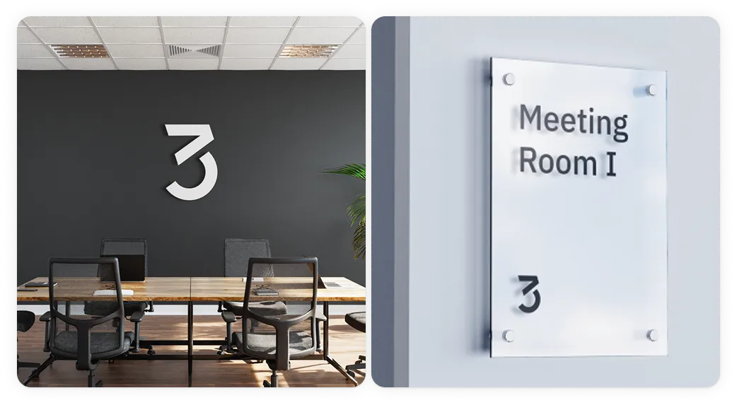
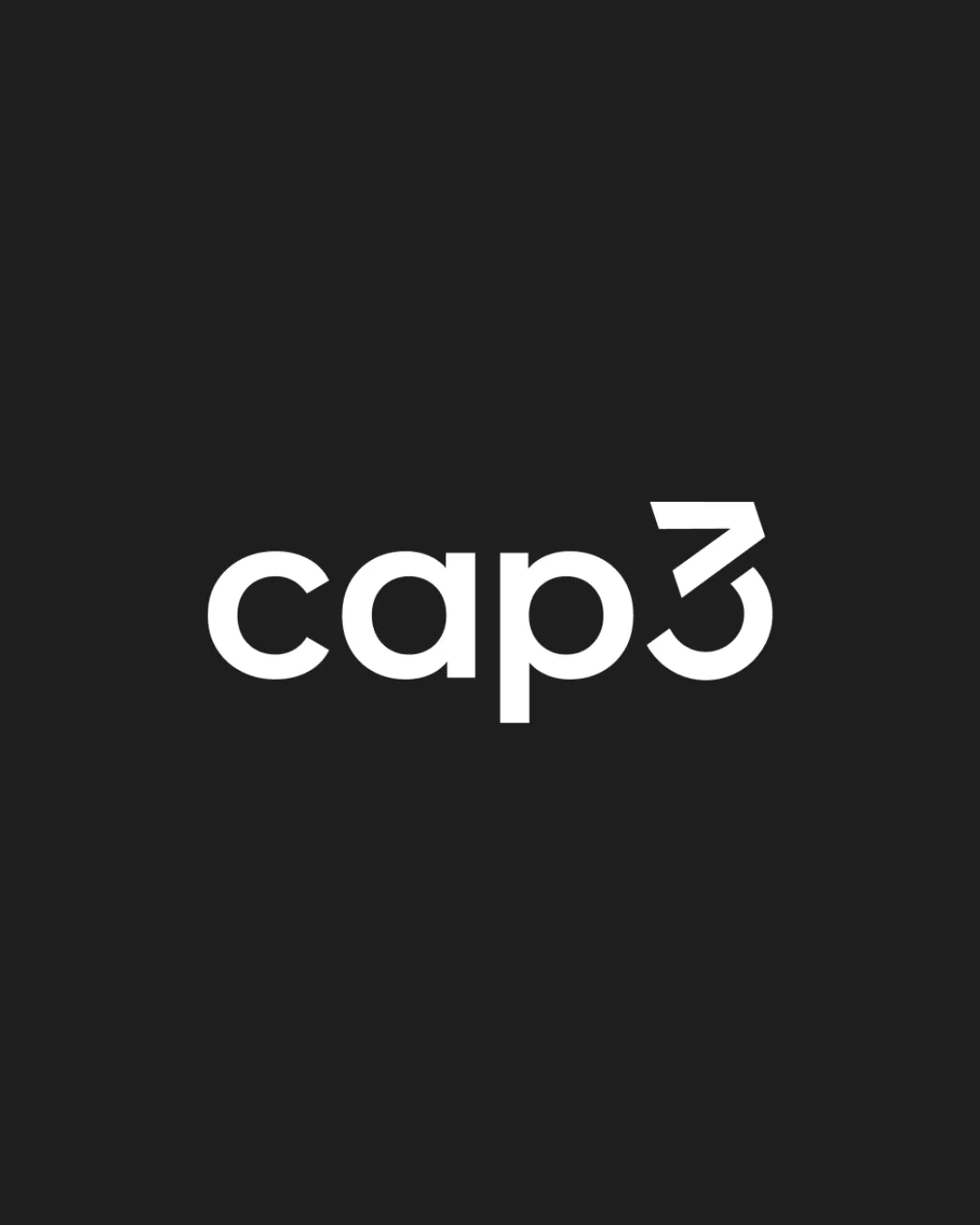
The structure of our logo in detail
Our new logo is more expressive. It combines our central features in a contemporary design:
The lettering “cap” is set in a geometrically inspired font — in Montserrat.
The basic forms of the letters and the “3” are based on four circles. The slightly upwardly tilted greater than sign (>) provides an exciting contrast to the curves. This character is an integral part of typical code syntax, such as in </> . This symbolism is known from HTML and has established itself over the years as a visual sign for programming and working with code.
At the same time, the tilted shape is reminiscent of an ascending arrow — it stands for progress, growth and development. Together with a semicircle, this results in the new, distinctive Cap3-Three.
What makes the new logo better compared to its predecessor
Better legibility: The lettering is set in black and replaces the previous bright shade of green — for greater contrast and greater visual presence. Even on small displays or when visibility is limited.
More compact form: Ideal for social media, apps and advertising materials.
Contemporary appearance: Reduced but with character.
.webp)
typography
Until now, the Signika font has been used — as in the logo. Although Signika is an easy-to-read font with a friendly character, its soft curves and playful shapes make it less technical and is therefore not an ideal fit for the positioning of a software company.
That's why we opted for a more concise and distinctive font that better underlines our orientation as a modern tech company: IBM Plex Sans.
Developed by IBM and published as open source, this Grotesk font combines technological precision with human approachability. It impresses with excellent readability — both in print and in digital applications such as web and mobile interfaces.
.webp)
.webp)
paints
Until now, a light shade of green has been used as the primary color, which was used, for example, in headlines and other key design elements. However, as already mentioned, in many applications — particularly on bright backgrounds — the contrast was not sufficient for good readability.
As part of the redesign, we have therefore made a conscious decision to significantly reduce the use of color overall. The new color strategy involves using two revised shades of green only specifically as accent or highlight colors:
- A light shade of green for use on a dark background
- A darker shade of green for use on a light background
As a result, we not only improve accessibility and readability, but also create a quieter, more focused design that focuses more on content and structure. The colors provide targeted support — rather than dominate.
A visual foretaste of our future
The new CD is being introduced step by step: on the website, in presentations, on social media and print materials.