Colors in user experience and user interface design

About the project: BeachNow brings digitization to the beach. The innovative booking system for beach chairs allows beach visitors to book a beach chair via the app or website as soon as they are planning their vacation or spontaneously on site.
Brand colors
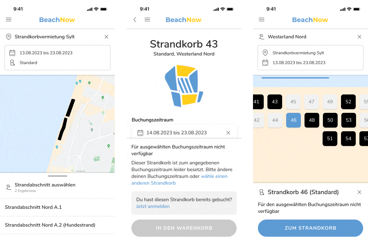
To get started, let's take a closer look at the brand colors that make up the CI (corporate identity) of the product. The primary color (also called “primary” in our case), which is found in many elements in the app, is a shade of blue in this example. The secondary color here is a shade of yellow. This sound is primarily used in the logo or graphics.

The brand colors were chosen based on BeachNow's beach theme and represent the sun and the sea, which also form the logo of the product. By adding these two colors, the screens get more depth, the logo stands out and is recognized as such, the button becomes more present and links in text form can now be recognized.

Colors for clarity
There are also other CI colors, which in turn are for clarity. The shades are derived from the primary and secondary colors to create a coherent overall picture and good color harmony. These shades of yellow and beige are mainly used for beach cards.
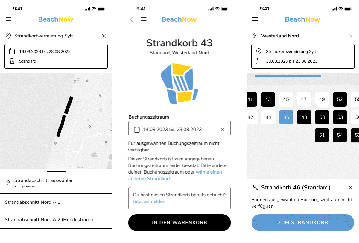
Shades of gray
Next, we'll look at the shades of gray, which are used in darker shades for the font. The lighter shades of gray, on the other hand, are used for shadows or even for functions that are not available, such as a non-clickable button (disabled button). With these shades, it is important that there is a clear contrast ratio between the lighter and darker colors so that everything is easy to recognize and read. The use of different shades of gray gives the screens more structure and creates a clear hierarchy between the elements, as our example clearly shows.

System colors
Finally, we will introduce you to the system colors. These colors are intended to alert the user to something, such as an error condition. Here, we differentiate between a “Warning” color, “Success” color and “Error” color. In doing so, cultural conventions were followed and a shade of red was used for error messages, a shade of yellow for warnings and a shade of green for success. With all three system colors, it is important that they differ from each other and from the primary color (brand color, here blue). Furthermore, when distinguishing between the system colors (red and green), care should be taken to ensure accessibility, as part of humanity suffers from red-green visual impairment. There are various tools for this purpose, which can simulate visual impairment by changing the colors on the screen. If you notice that shades of red and green are too similar, these colors can be adjusted again.

The signal colors are not only used to display error or success messages, but in this example also to communicate information. Here, the signal colors are used to inform the user about beach chair occupancy or availability.
As you can see from the examples, colors are a decisive factor in UX/UI design to create a positive user experience and make the application easier to use. They are coordinated and therefore ensure a harmonious overall picture. In addition, the small color palette provides a better overview.